BRANDING
1/4
Brand Identity
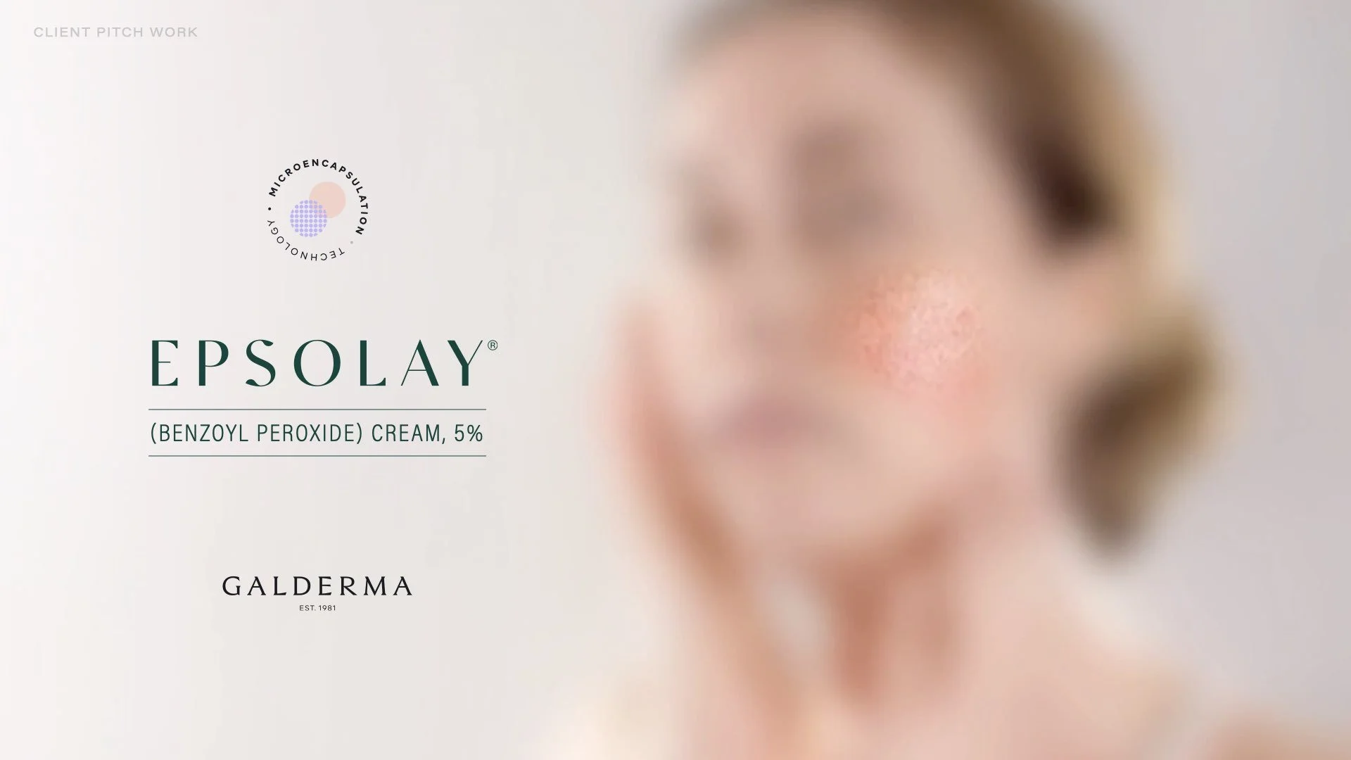
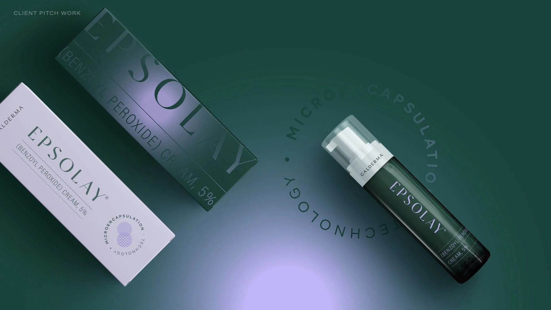
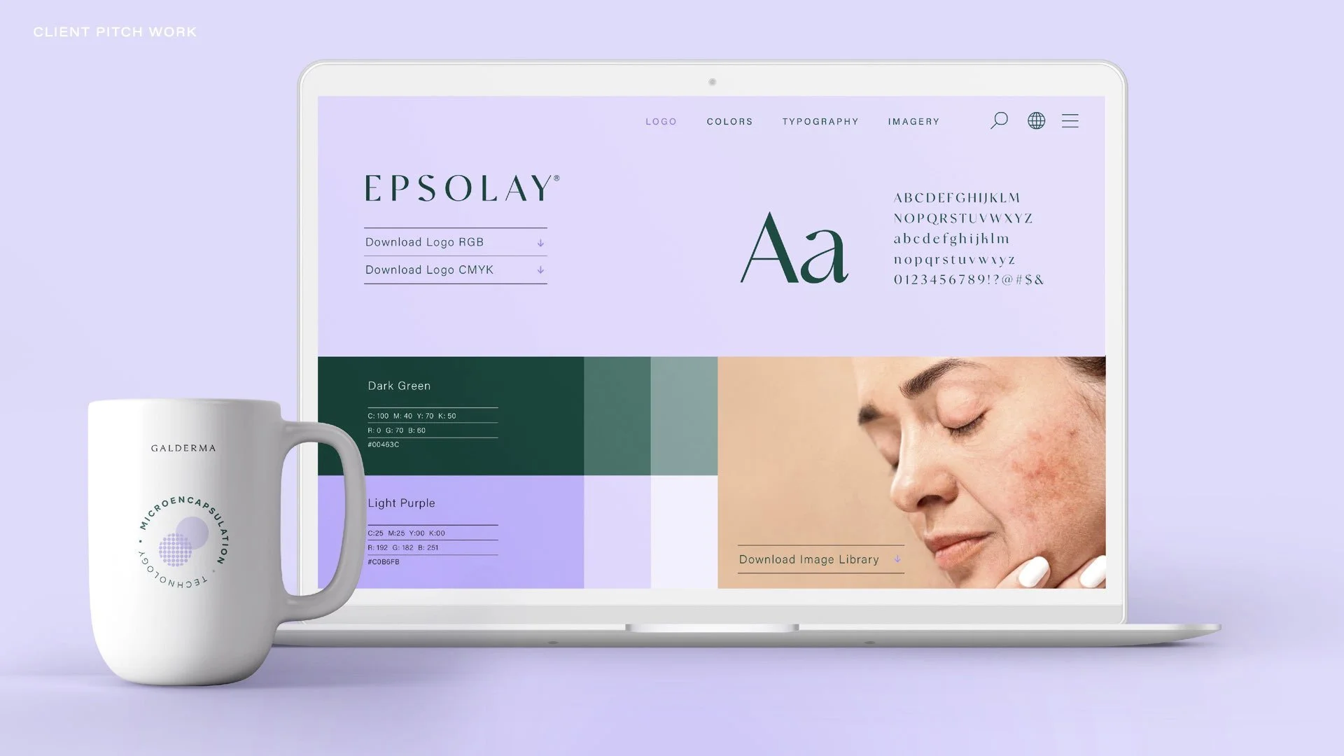
THE OBJECTIVE
Create a new look and feel for a skincare brand, potential client (now a current client, the pitch was successful).
THE SOLUTION
Collaborating closely with my Creative Director we crafted a fresh and elegant brand identity that swayed from the typical pharmaceutical skincare look and feel, proving science, medicine, and beauty can go hand in hand. Often times prescription medicines have a similar clinical look and feel, and we wanted to offer an option that turns that expectation on its head. Just because a product is behind the counter doesn’t mean in can’t be visually appealing. We collaborated on creating a colour palette, logo lock ups, graphic elements, photography style, as well product mock ups. I also participated in presenting at the live pitch.
2/4
Brand Evolution
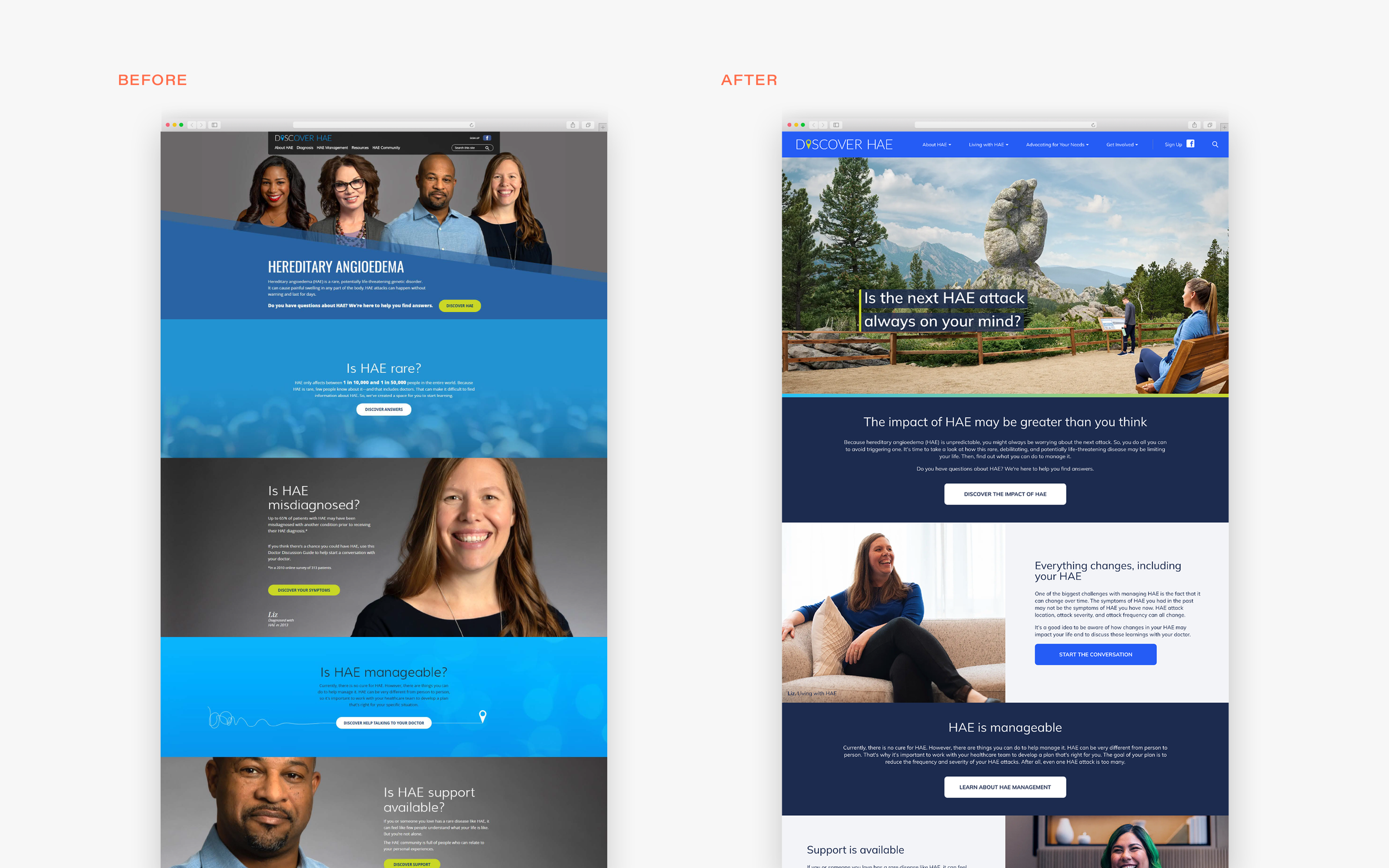
THE OBJECTIVE
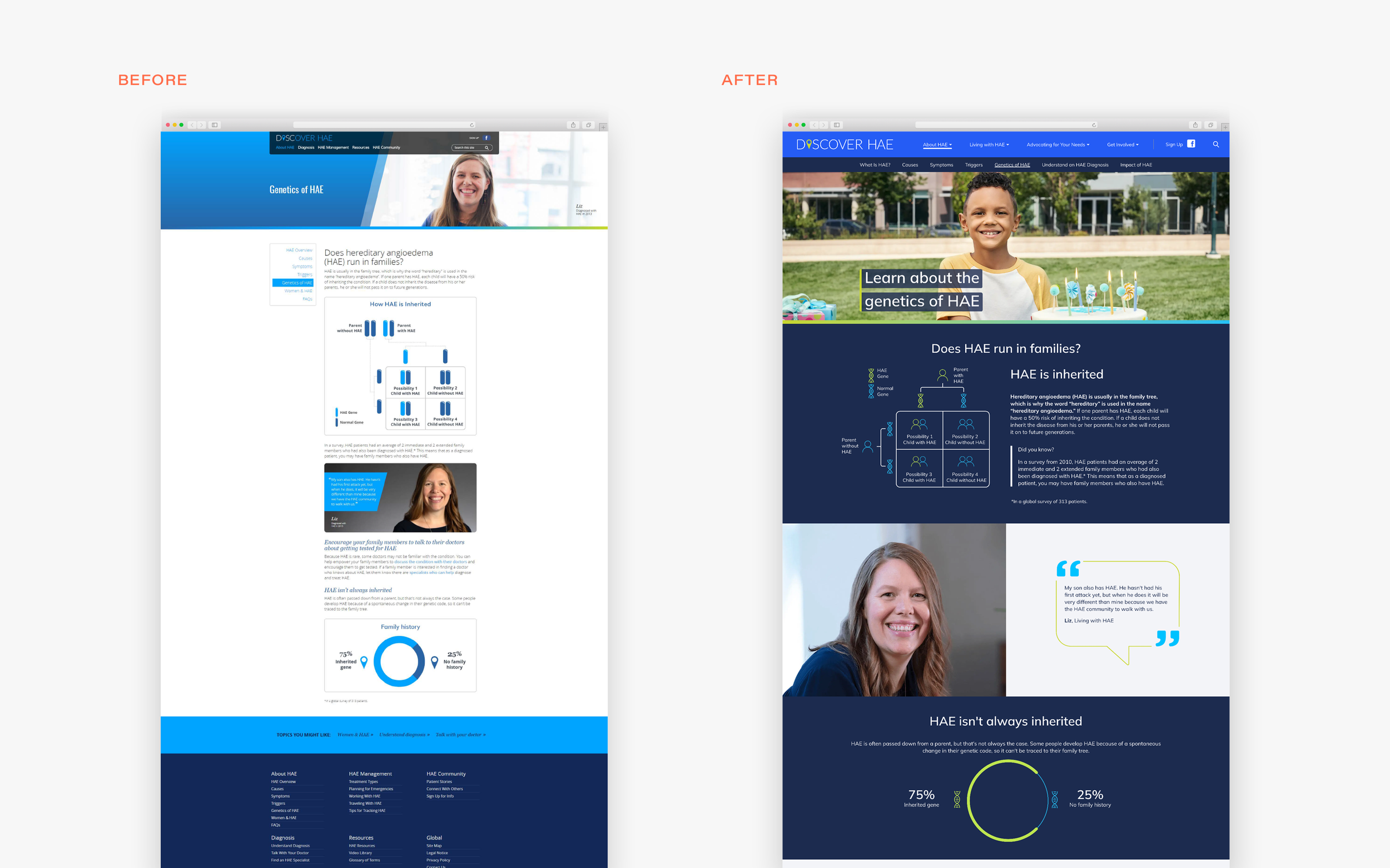
Refresh the existing brand identity without too much of a departure from the existing look and feel. Create an updated brand guidelines as well as work with the digital partner agency to update the website.
THE SOLUTION
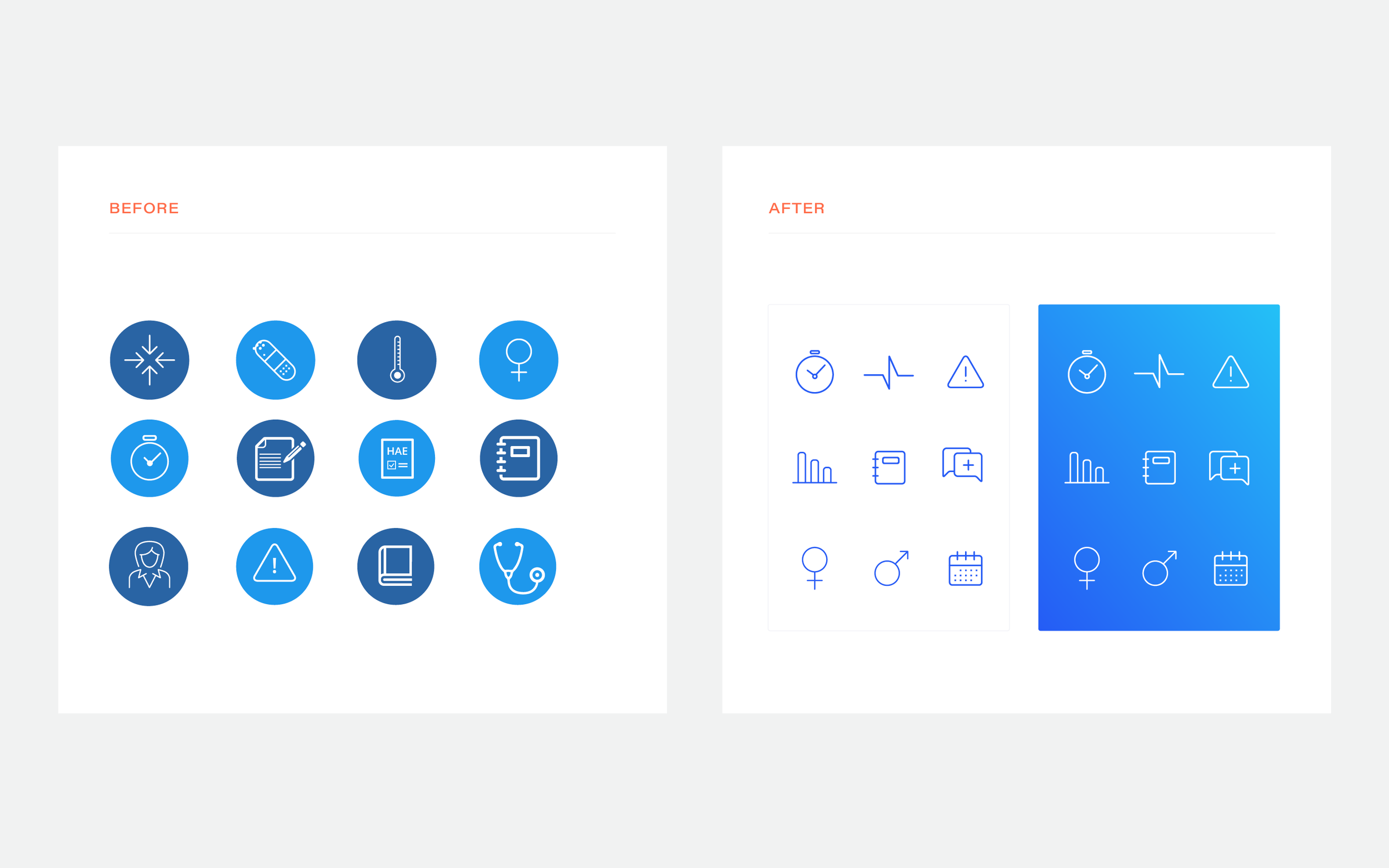
Refined the colour palette, streamlined graphics, and art directed the website update. I was given the opportunity to lead this project, collaborating with team members and creative directors on developing an evolved brand identity that remained close enough to the original look and feel to keep brand recognition, while tweaking brand elements to feel more modern. For example, brightening up the colour palette and creating more contrast brought it into the contemporary space and also enabled us to meet AAA web requirements. Streamlined typography, logos, iconography, and graphic elements all work together more cohesively, as well as the updated website design and content, and while minimal, these all work together to present a fresh look and feel that the clients were very pleased with.

3/4

Brand Evolution
THE OBJECTIVE
Evolve the existing brand identity without too much of a departure from the existing look and feel.
THE SOLUTION
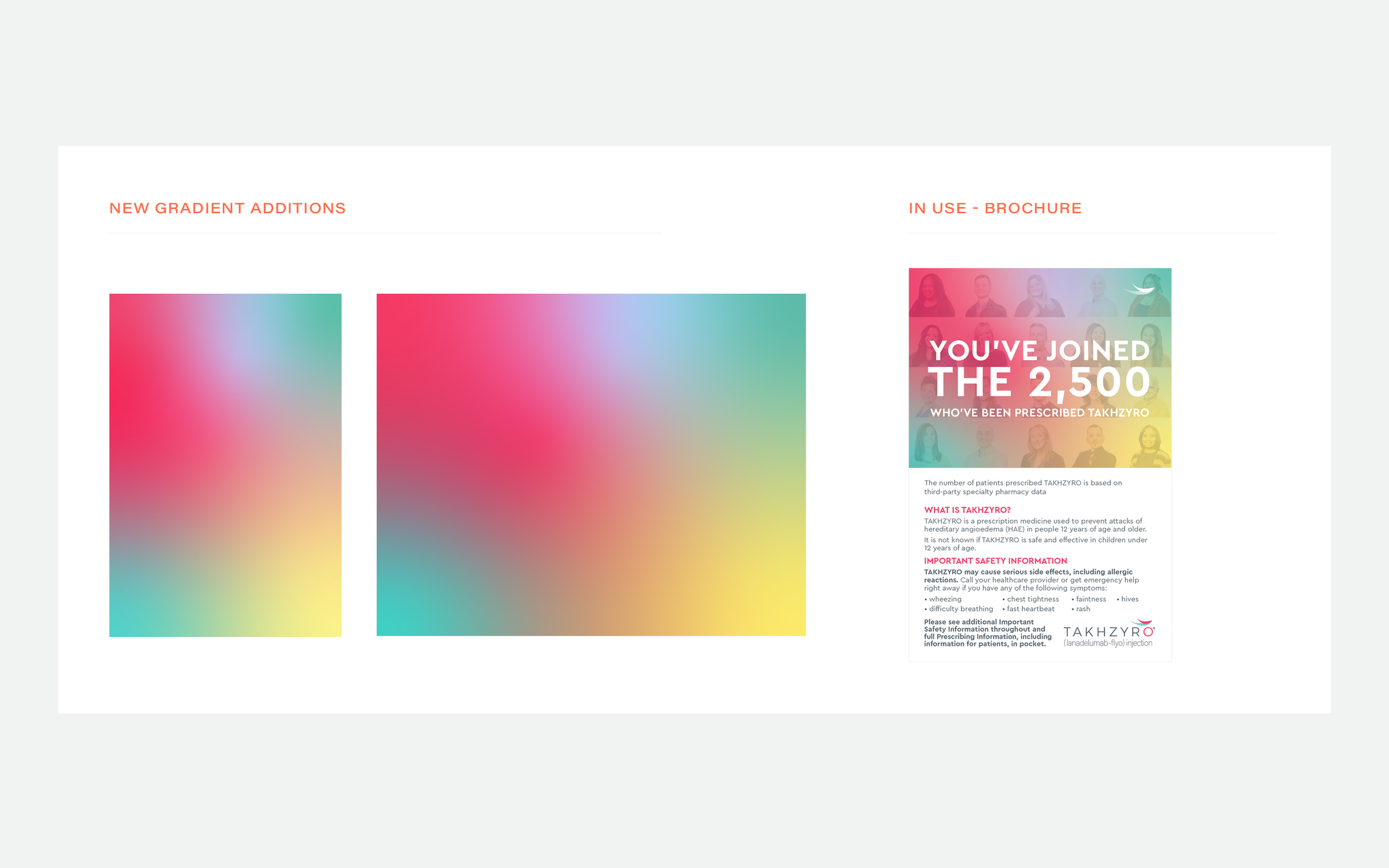
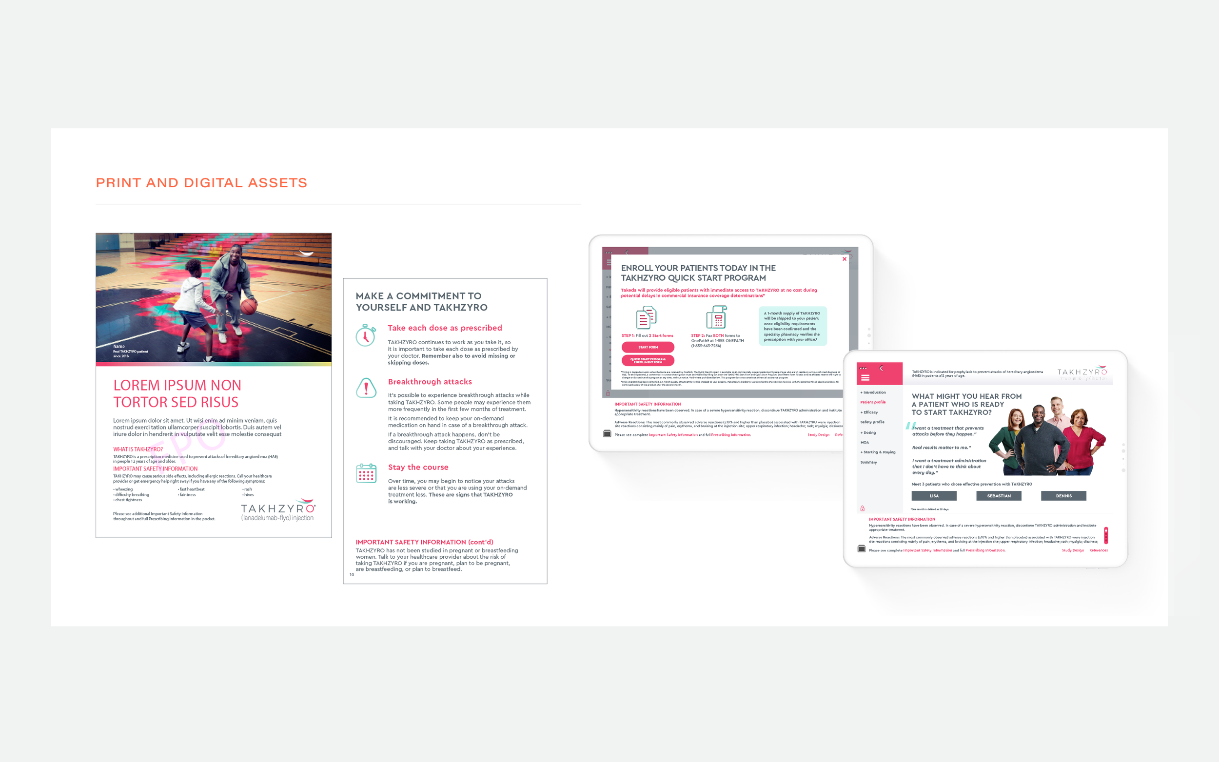
Collaborating with team members and creative directors we crafted a freeform gradient, that could be brought across print and digital, working well with existing assets. In addition to the gradient we also updated the existing icons, streamlining the overall design. This was a very minimal update, however it made a large impact on the overall design pieces that followed. This brand has been around for a few years and the creative team as well as clients aligned that it would be helpful to create more interest by adding new elements so the materials stand out from their usual designs that HCPs (the brands target market) have become accustomed to seeing. The outcome was successful, and we had positive feedback as Reps and HCPs took interest in the changes.

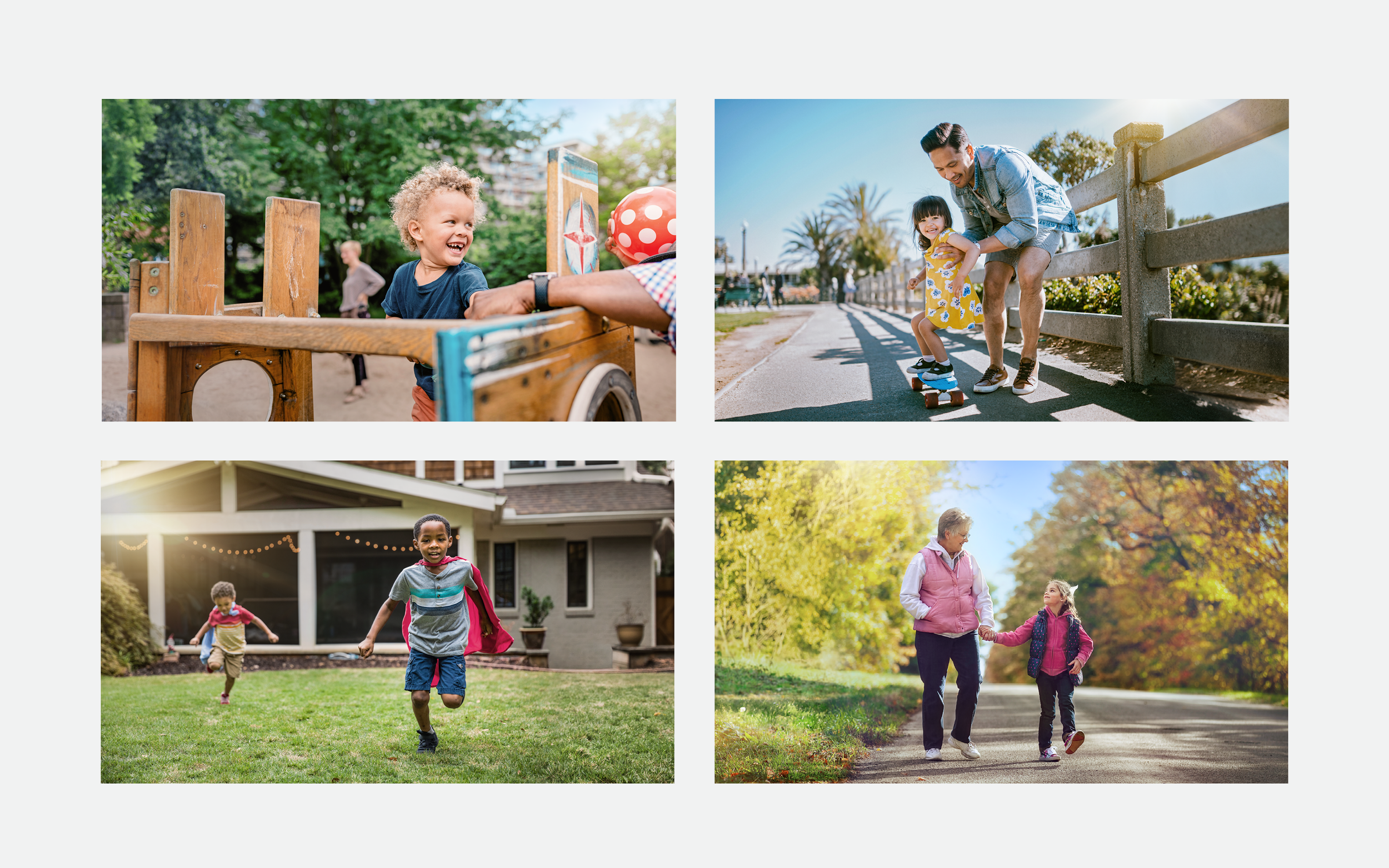
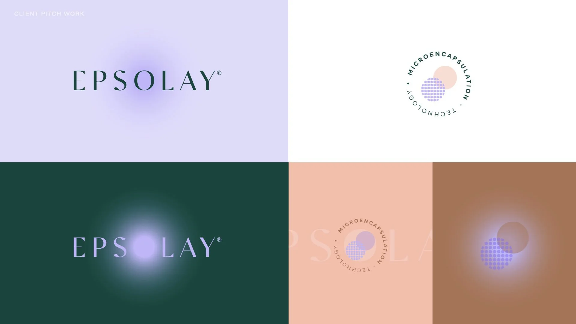
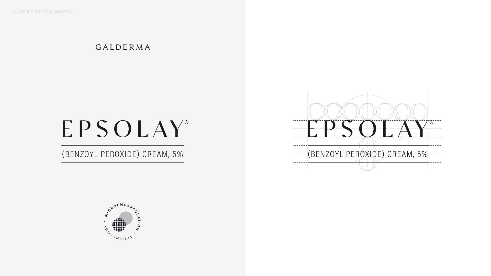
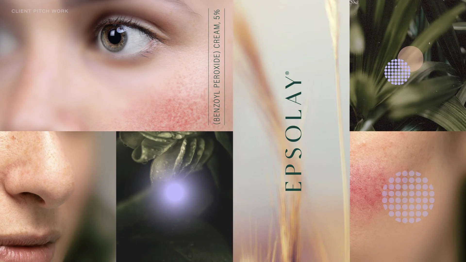
4/4

new brand identity
THE OBJECTIVE
Create a new identity for a paediatric label that works in tandem with the existing identity of the adult label.
THE SOLUTION
Collaborating with my Creative Director and creative team I was given the opportunity to lead this new project. We successfully crafted a look and feel that works cohesively with the adult label yet clearly differentiates itself. To do so we focused on the use of colours. While the adult primary colours are magenta and verde, we chose lavender as the paediatric primary, which is one of the secondary colours in the adult palette. We crafted a new freeform gradient, championing lavender. In addition to the gradient we also updated iconography and infographics, as well as new photography assets. While not ideal, we were able to work within the clients budget to leverage stock images, partnering with editing vendors to edit this chosen images to align with our adult photography assets.