WEBSITES
1/2

new website pages
THE OBJECTIVE
Create new website pages for the gMG Cycle website which include new information, increase CRM sign ups, and increase engagement across the website.
THE SOLUTION
Collaborating closely with the Lead Designer and creative team members, we crafted multiple new pages for the website. I worked on the ideation of the new pages through to the creation. The ideation included content and purpose, for example to increase CRM sign ups we created an interactive game that was teased on the CRM page and could only be played once the user had completed the sign up. In addition, to increase engagement across the site we also included animated graphics across pages, highlighting new information, as well as added a new interactive quiz. The quiz CTA lives on every page of the website and draws the user in to “Test their knowledge”. I also oversaw the execution of all pages, working closely with our in-house development team to bring my designs to life.
Visit gmgcycle.com to browse the designs in action.


2/2

Website in-one-day
THE OBJECTIVE
An internal challenge amongst the design team at m+a to encourage practice and test our skills using Figma. The challenge being to create three or more pages of a website which use the a social media platform to inform content.
THE SOLUTION
The “Decision Maker” microsite. This theoretic site uses data from your Instagram account to push suggestions on possible travel decisions such as “where to go”, “where to stay”, and “where to eat”. As a frequent traveller with decision fatigue I thought it was an interesting concept, and more importantly, would be fun to execute. I used lots of colour blocking in this responsive design, as well as bold icons, and sourced fresh, eye-catching photography.
Humble brag, I ended up winning first place, voted by my peers.

3/3

Brand Portal
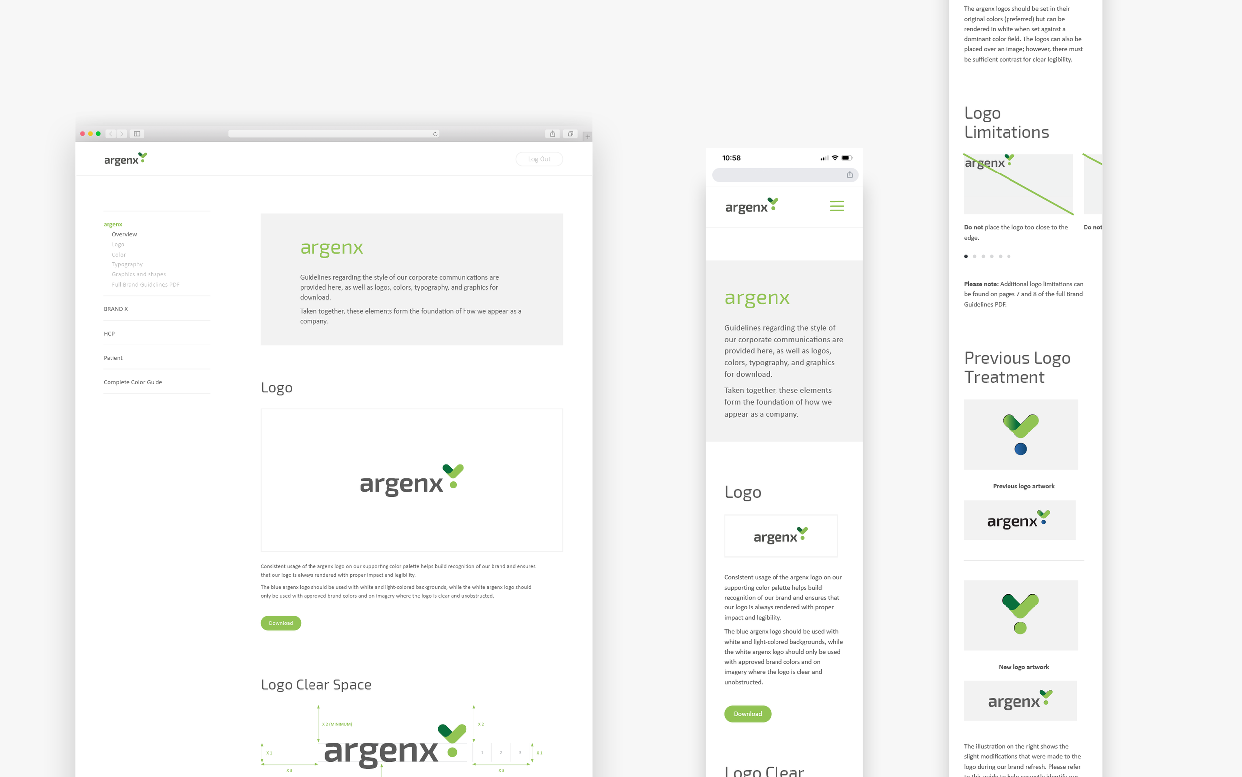
THE OBJECTIVE
Create a website that can host all the brand guidelines in one, easily accessible location.
THE SOLUTION
An online brand portal that can be accessed across the globe using a password protected log in. Our client at the time was one of multiple brands under the same parent company. My creative team and I collaborated with the client to create one site which we designed to be easy to navigate across the multiple brand guidelines, with very light branding. The light branding was very intentional, it allows the content of each brand guideline to shine as well as lessens the chance for confusion amongst guides. Minimising the amount of clicks where possible we kept designers as well as non-creatives in mind so that anyone can easily access brand information and download assets all in one place, which in turn also saves time on the marketing team. It was also designed very strategically so that any future designer creating a new page or adding a new brand guideline, can easily copy the same format.